Open Science Repository
TIME
Spring 2022
CLIENT
Open Science,
University of Copenhagen
TEAM
3 Scientists, 1 Data Manager,
1 Programmer, 1 Designer (me)
WHAT I DID
Re-design, UI/UX/IA
Design System
Clickable Prototype
Deliverables
Design system / Ui kit
150+ components
80+ screens
The background
Squidr is a platform for scientists to store, share, and retrieve scientific studies. Thus, it aligns with the noble promise of science as a community of collaboration and support. Technology has played a huge part in this development, and it has been made actionable by organizations like Open Science and the development of FAIR principles.
Scientific studies have complex designs and methodologies, which must be dealt with in the upload process for data to be interoperable and reusable in the best conditions possible. Archives of scientific studies should be characterized by accommodation of all data types in a flexible framework for allowing any study design. Datasets and studies should be uniquely identified, accessible and searchable. Squidr aims to fulfill this goal for the area of experimental or observational biomedical research, but we hope it will be further developed to accommodate many other areas of research. The code and data are freely shared under the creative commons CC-BY license.
Squidr should prevent loss of data and allow new research based on all the data from previous studies. Squidr will also allow better transparency in research by making it possible to gradually open study data and protocols to a wider group of fellow scientists or even the full public.
Task flow
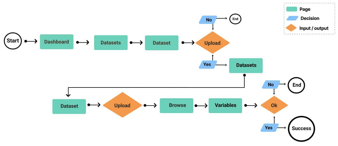
Uploading a dataset is a complex task because of a great variation in the design of scientific studies. As this is one of the main user flows, we wanted it to be easy and user friendly. Through iterations we landed this flow.

The structure
We designed an information architecture/ IA to better understand the structure and the relationship and connections between the pages. Eg. this revealed redundancies and pages that could be merged together.


Design principles
The focus is user-centric with the goal to be easy to use. We build a hierarchy by the use of spacing, typography, and product colours, to keep it easy to navigate the interface and be informed about where you are.
Open Up
Your Research


The users
We mapped some user profiles to be further investigated when the system is ready for testing.

Task flow
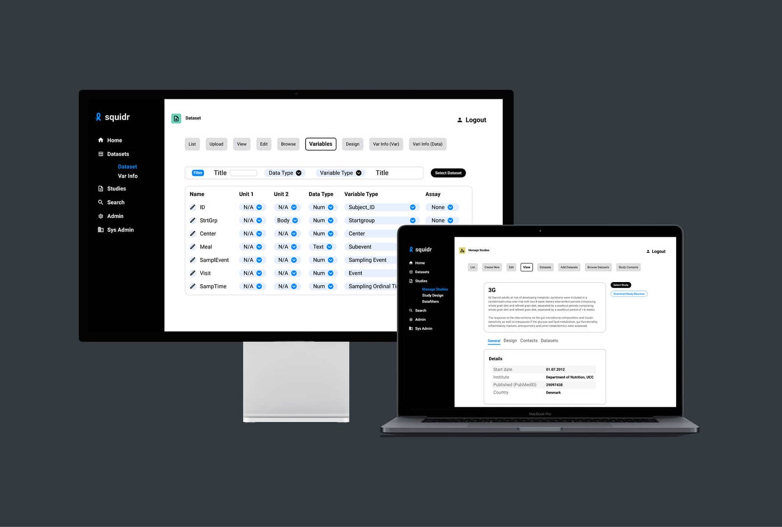
The hi-fi wireframes show the screens the user goes through to upload a dataset.
