Research, branding, interaction design, prototype
Efortlessly banking
Client
Product design, LABASAD, Barcelona
Role
Research, branding, interaction design, prototype
Timeline
5 weeks
Tools
Figma, Jitter
Overview
Traditional banking apps are confusing, slow, and built for the wrong generation.
The Problem
Digital-native users expect speed, clarity, and trust from their bank, but most apps still feel as if they were built for a branch visit. Sending money takes too many steps. Balance overviews bury the signal in noise. And when a card gets compromised, users feel powerless. Our client needed a banking experience designed from the ground up for Gen Z.
Outcome
- Brand mobile banking app with end-to-end user flows.
- Scalable UI kit
- Optimised 3 core flows
Approach
I started with interviews and a competitive benchmark across apps like Lunar, Monzo, and AYA – mapping where the category communicates trust well and where it falls short. Three concepts were developed and tested: a conservative approach, a high-energy one, and a third direction that balanced both.
From the winning concept, I built out the full brand, a scalable UI kit, and high-fidelity screens for the three core flows users struggled with most: sending money, reading their finances, and managing card security.
Gen Z interviews → benchmark → concept exploration → UI system → prototype.
Image: storyboard
Image: user journey
Image: UX research insights
Image: user personas
Image: branding and UI kit
Image: user flow
Image: wireframes
Image: prototype, onboarding
Image: prototype, transfer money
Image: prototype, overview
Image: prototype, security & learining hub
Key features
- Transfer – Send money via phone number or email in a handful of taps, no account numbers, no confusion.
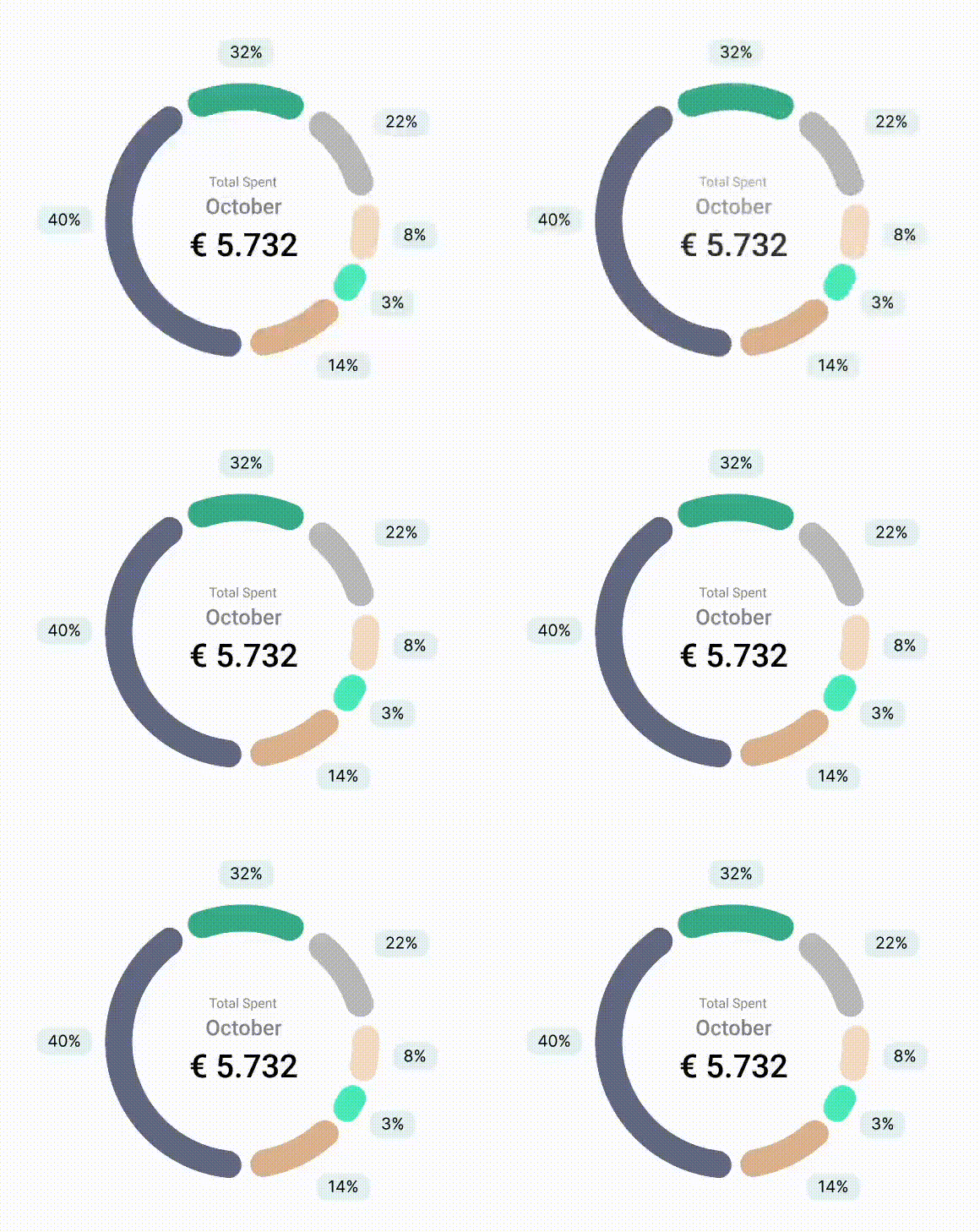
- Overview – Intuitive charts replace raw transaction lists, with multi-level breakdowns and live card mapping.
- Security – Users can freeze, limit, or cancel a card instantly, and access safety shortcuts without hunting through settings.
Design details
The full brand includes a logo where the Z nods to Gen Z and the dollar sign. The UI kit ensures the system can scale as the product grows.
What made this project unique
This project combines research, branding and interaction design in one flow, from Gen Z interviews to a prototype. The brand, with a Z that nods to both Gen Z and the dollar sign, carries through a scalable UI kit and the three core flows: transfer, overview and security. The aim was a bank that feels fast, clear and trustworthy from the first tap.
Image: 1. Transfer money, 2. Overview, 3. Security
Outcome
A complete, brand-led mobile banking product, from logo to prototype, designed to give Gen Z users genuine control over their finances.
- Full brand, from logo to prototype
- End-to-end flows for transfer, overview and security
- Scalable UI kit
Reflections
[]